
CHALLENGE
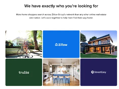
Zillow is reimagining how people buy, rent and sell homes, empowering them with the data and services they need to get into a place they love.
HOW I HELPED
This is how I helped craft an AI powered tool leveraging a co-creation approach to empower real estate agents to meet home shoppers’ on-demand expectations by connecting them live in less than 90 seconds.
CORE DELIVERABLES
- Redesigned experience leveraging NLP/AI
- Service blueprint
- User journey
- Scalable design library
The team and my role
- Team: Core Technology
- Product Owner: Bilal Khan
- Engineer Project Leads: Joel Kopelioff and Harshita Mehta
- Snr. Project Manager: Chanel Shih
- Design Lead: Reagan Sirengo
- Supporters:Pearl Development Team, Connections Ops team
- Core Users: Connections team, Sales Team, Loan officers
- EXPLORE PHASE
DEFINE THE NORTH STAR
- Why: Unlock faster, more human equity conversations for 1 million+ shoppers.
- Goals: Cut “agent-connect” time to < 90 seconds; raise session revenue; ship WCAG-AA from day one.
- Leadership Moves: I authored a one-page press-release narrative that framed Pearl as a conversational AI sidekick and tied success to Zillow’s OKRs. I logged model bias and privacy as guardrail risks and set a target NPS of greater than 55.
- Key Output:North-Star narrative & metric dashboard, Insights & opportunities, business and user goals, success metrics.
PRODUCT ENTRY POINT
FIGURING OUT THE PROBLEM
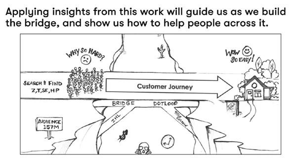
To understand the problem, I interviewed a few users to gain insight. Once I had a hunch about what might be happening, I followed up with a larger survey of people who had signed up but not completed the setup.
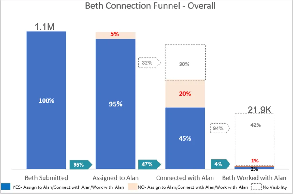
- Overall, 2% of Beths who submitted a contact have a confirmed working relationship with Alan.
- Of the 1.1M Beths who submitted, 21.9K (2%) have a confirmed relationship with Alan
- Limited Visibility is a challenge. We currently cannot tell whether or not
- [Connected with Alan] in 32% of the cases where Beths assigned to Alans
- [Beth is working with Alan] in 94% of cases where Beth was connected with Alan.
INITIAL KPIs
The criteria for a good experience outcome
- Memorable: Resonates with both the user and the product team
- Evidence-based: Rooted in customer insights
- Measurable: Provides a basis for measuring success
- End-in-itself: Describes a problem-to-be-solved/job-to-be-done; never refers to a solution or feature
- Scoped: Describes the smallest meaningful and actionable unit of customer value; Has one verb at its core
- DISCOVER PHASE
IMMERSE & FRAME
- Why: Prove the problem is real and pinpoint friction.
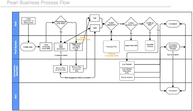
- Goals: Uncover blockers in the existing “Beth ↔ Alan” lead-routing flow.
- Leadership Moves: I ran 30 in-depth agent interviews, a 1.1 M-record data audit, and a follow-up survey of incomplete sign-ups. Findings: only 2 % of shoppers (“Beths”) ever formed a confirmed relationship with their matched agent (“Alan”)—with visibility gaps in 32 % of cases.
- Key Outputs: JTBD map, persona, competitive analysis, user and stakeholders interview, opportunity brief, risk heat-map.
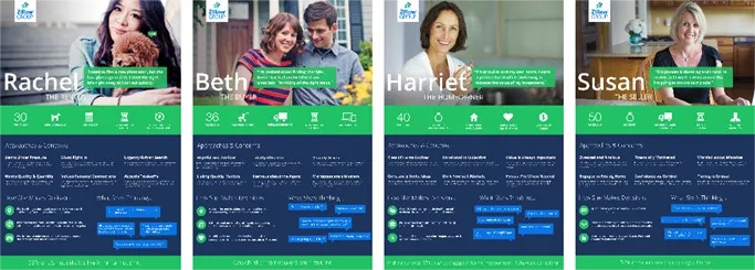
PERSONAS
This persona work was a result of numerous user interviews, which led us to find our target users who are savvy despite a lot of constraints and doesn’t have time for messy content.
RESEARCH
Like any good renovation, we knew we had to start by laying the groundwork. We ran four user research studies and audited the existing UI.
APPROACHES AND TOOLS
I traveled to various offices to observe, talk to and document how people use the tool, opportunities and the unmet goals. I wanted a way for product teams to easily refer to this research findings during the redesign.
RECOMMENDATIONS
- Design designated areas for specific notifications and alerts in convenient and helpful modules. This wouldallow agents to multitask better and find things easier.
- Redesign workflows to decrease the amount of clicks it took to perform certain tasks.
- The color schemes need to make it more comfortable to stare and read text on a screen for long periods of time. Work on accessibility
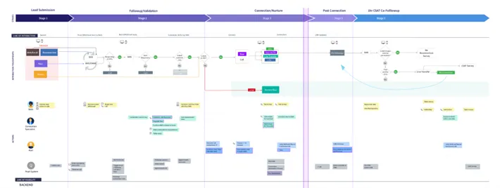
- Design withunderstanding their customer journeys across various channels and contexts and support them through Ul design
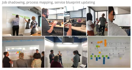
JOB SHADOWING
- DESIGN PHASE: CO-CREATE CONCEPTS
Why:
- Generate bold options, pick the strongest.
- Derisk fast; validate desirability, feasibility, and viability.
- Secure commitment and ownership.
- Ship an accessible, performant product without slowing velocity
Goals:
- Short-list flows that cut clicks and surface live context.
- Hit ≤ 90 sec connect time in pilot; maintain full keyboard access.
- Green-light MVP; assign DRIs for backend refactor, AI tuning, and WCAG audits.
Leadership Moves:
- I facilitated design-jam sprints across design, engineering, and sales.
- Rapid storyboards highlighted AI pre-fill and hot-key dispositions to erase copy-paste toil.
- Five-day sprint produced an interactive prototype; pilots with power users surfaced color-contrast tweaks and shortcut refinements.
- Formed design-dev pods; tokenized color palette to guarantee AA contrast; paired with engineers on trunk-based commits.
Key Outputs: IA, User flows, screen flows, concept design/sketches, wireframes/mocks, clickable/interactive wireframes, usability research, design taken system, detailed UI, pivot-or-proceed decision, Decision log, roadmap v1.0, accessibility test plan
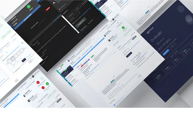
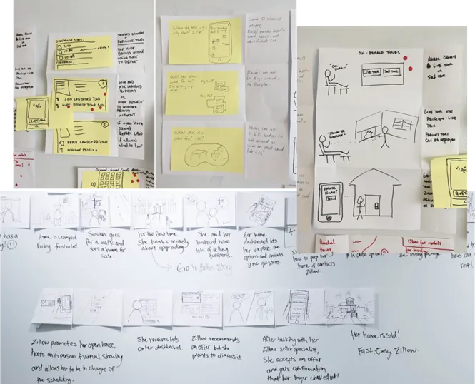
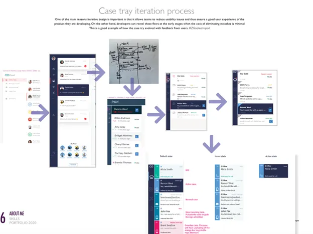
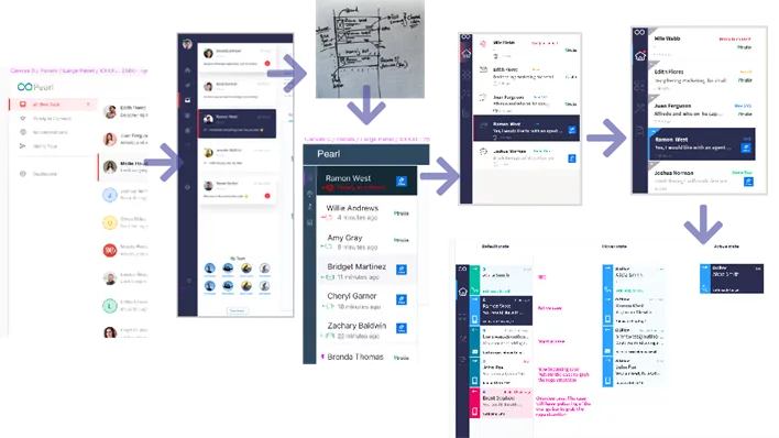
SIMPLIFY THE FLOW
While I designed states for every piece of the flow in the next page, collaboration was essential. These seemingly simple iterations solved the problems of the original flow, but like most “simple” design, it took a lot of complexity to get there.
To increase productivity, I proposed a change in the flow, which we explored how AI can help in the conversation to pre-fill commonly asked info to avoid copy and paste. Quick wins
- I worked with engineers and operations teams to get them to match user needs
- I prioritized user tasks based on research findings.
- I collaborated like crazy with users and user representatives.
PROPOSED NEW FLOW
Goals: Hit ≤ 90 sec connect time in pilot; maintain full keyboard access.
FIXING THE PROBLEM
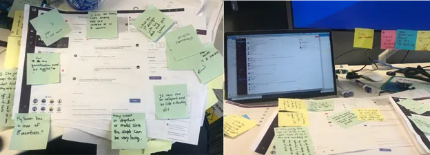
I collaborated with the team via design thinking workshops and held several design crits with the larger design family from the company on the design. Here’s some of the output of that collaboration.
The discussions with friendly and passionate colleagues were among the best parts of working on this project. We were able to deep-dive into the meaty questions, the details, and the far-flung ideas about what could be possible. As a designer, it is incredible to work with developers and product managers who care so much about the design process and have so many great UX ideas.
SKETCHING AND WHITEBOARD SESSIONS
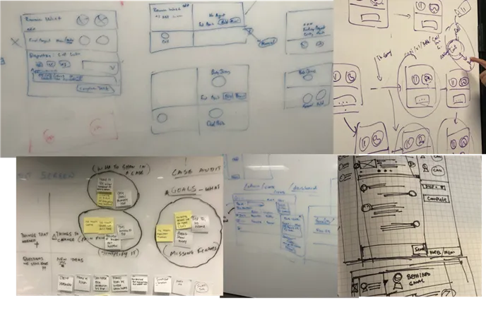


[PRODUCT WIREFRAMES WALKTHRU- VIDEO]- https://drive.google.com/file/d/1ch1RlVq8VTgeNXIrror3RSOaFU8wLPEd/view?usp=drive_link
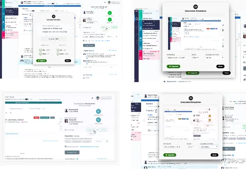
VALIDATING OUR DESIGN ASSUMPTIONS
I collaborated with the team via design thinking workshops and held several design crits with the larger design family from the company on the design. Here’s some of the output of that collaboration.
BUILDING THE TOKEN DESIGN SYSTEM
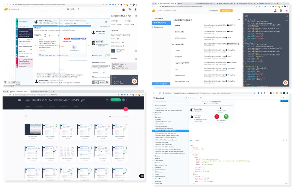
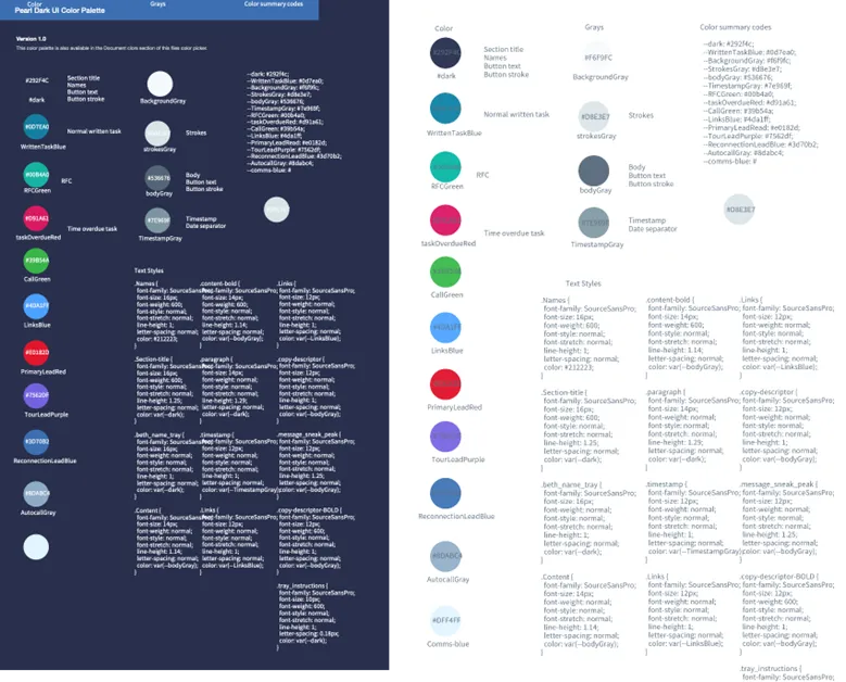
ADDRESSING ACCESSIBILITY AND USABILITY ISSUES
- DELIVER PHASE
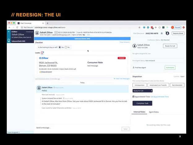
FROM OLD TO NEW
NEW EXPERIENCE


End end product video(Pearl UI calling happy path.mov: https://drive.google.com/file/d/1MwDpjoNmWXHMwYPOf36zez51HMDEYgLU/view?usp=sharing
KEY TAKEWAYS: DESIGNING FOR AI
Machines are clearly superior to humans at certain tasks, but before we delegate something to them, we should ask ourselves some questions: Will the machine really be better than a human at this task? Will we benefit from this particular application of automation? What are the ethical implications? Before automating a task, we should consider very carefully the impact on everyone involved and what role we still really want humans to play in our society.
Ethical considerations must be actively integrated into the design and development process. Designers need to bring the necessary empathetic context for innovation, which is how a business will succeed with AI.
Our main KPIs wre achieved through:
- Ease and Speed of Use: By use of hot keys for frequently used actions
- Convenience: By use of AI to tag predict an action without thinking through
- Clarity and Control: By use of system alerts for any changes and keyboard shortcuts
HOW WE DEPLOYED THE UI
- Back-end development team needed to update its tech-stack, while maintaining the one that was powering the existing users.
- Front-end development had a head start, as we collaboratively build the front-end, test it with users and iterate before plugging in back-end functionality.
- Released the new UI to 20% users distributed in different regions and skillsets to learn and improve as we firmed the designs.
- RUN & SCALE PHASE
LAUNCH AND LEARN
Why: Measure real-world impact; loop insights, Sustain growth, safeguard trust.
Goals: Raise Customer Effort Score from 3.5 → 6.5 / 7; cut disposition errors < 4 %.
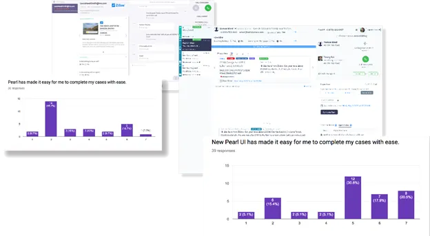
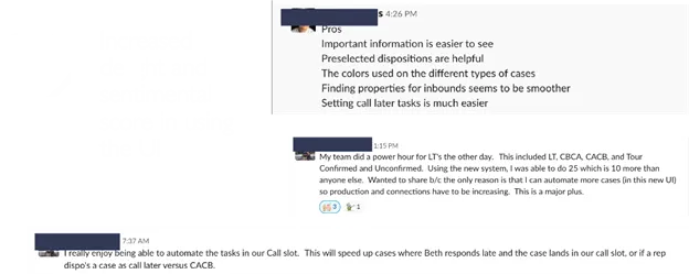
Leadership Moves: Staged rollout behind feature flags, A/B tests on hot-key adoption and AI tag accuracy. Results: CES jumped to 6.5/7; error rate fell to 3.33 % (-37 %). Added user-score micro-survey for continuous feedback,
Key Outputs:Launch report, experiment dashboards, knowledge-base entry, KPI tracker
HOW WE MOVED THE NEEDLE
- Adaptable screens to improves web accessibility to create consistency.
- Dynamic screens- only show features for a specific task i.e. don’t show call buttons when we are sending SMS
- One click approach for frequently used dispositions
- Content strategy: We reduced the amount of content overall, making sure that users knew where to focus.
- Improved accessibility and introduce keyboard shortcuts
- Improved dashboard and case audit tools for better reporting.
- Introduce an inbuilt User score tool to capture quick feedback for Pearl improvements
OVERALL WINS
- 6.5/7 Increase customer Effort score from 3.5/7
- System accuracy. Making the Ul more intuitive and capable so that reps reduce their errors by introducing;
- Top Dispositions with one click
- Automated Find Agent
- Disposition error down trend from 5.30% to 3.33%
| KPI | Pre-Pearl | Post-Pilot | Δ |
| Customer Effort Score | 3.5 / 7 | 6.5 / 7 | +86 % |
| Disposition Error Rate | 5.30 % | 3.33 % | –37 % |
| Confirmed Agent Relationships | 2 % | ↑ 3× (pilot cohort) | +200 % |
- Increased delight and sentimental score in using the Ul
- Met or launch deadline
MY LEADERSHIP INFLUENCE: Craft Lessons for YOU
- Data-Informed Storytelling – Every decision—from North-Star framing to pilot telemetry—was tied to a business OKR and a user-centric KPI for execs to lean in.
- Ethics as Velocity, Not Drag – By automating contrast checks and bias reviews, compliance became a sprint ceremony, not a last-minute scramble.
- AI + Accessibility = Scale – Hot keys, screen-reader labels, and language models together cut task time without cutting anyone out.
- Narrative Reviews Trump Slide Decks – Two-page memos forced clarity, sped decisions, and built cross-functional trust.
- Accessibility evangelist: WCAG-AA baked in from sprint 0; keyboard shortcuts, contrast tokens, and screen-reader labels treated as first-class features.
- Culture catalyst: By coaching pods in narrative reviews and inclusive design rituals, I boosted velocity, consistency, and cross-team trust.
IMPACT AT GLANCE
| Metric | Before | After |
| Agent connect time | ~3 min | < 90 sec |
| Confirmed shopper-agent relationships | 2 % | +3× uplift (pilot cohort) |
| Customer Effort Score | 3.5 / 7 | 6.5 / 7 |
| Disposition error rate | 5.30 % | 3.33 % |
| Accessibility compliance | Ad-hoc | 100 % automated AA pass |
Epilogue – A 90-Second Promise Fulfilled
Today Pearl handles millions of real-time homeowner conversations, proving that when AI is wrapped in thoughtful design and ethical guardrails, it doesn’t just move metrics—it moves lives. That’s the bar I bring to every product I lead: ambitious, data-grounded, human-centered, and ready for big-tech scale.
