
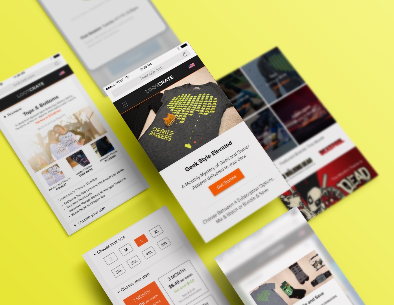
LOOTCRATE.COM: BACK TO BASICS SITE REDESIGN
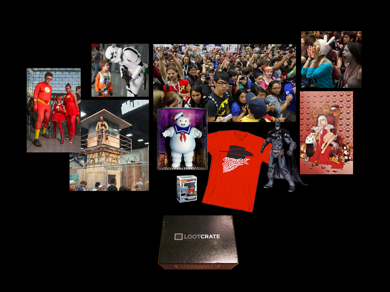
Loot Crate™ is a subscription box service established in 2012 that provides monthly boxes of geek and gaming-related merchandise. It is a worldwide leader in fan-commerce whose mission is to unite the world through the shared celebration of fandom. Loot Crate partners with industry leaders in entertainment, gaming, sports, and pop culture to deliver monthly themed crates, produce interactive experiences and digital content, and film original video productions.

MISSION
Re‑architect Loot Crate’s subscription‑commerce experience around growth and conversion metrics while meeting WCAG AA accessibility and laying a scalable design‑system foundation that could support rapid expansion of themed product lines.
PROBLEM
By Q2 our churn had spiked to 42 % after Twitch and Reddit spoilers sapped the “surprise” that kept subscribers hooked. Mobile delivered 70 % of visits but just 40 % of revenue, with a 45 % bounce rate and a 2 % checkout conversion. Hundreds of orphaned legacy pages buried us on Google, and churn spiked to 42 %. The business faced an existential cliff.
MY ROLE
Hired as Head of Product Design, I reported to the COO with a blunt mandate: re‑ignite subscriber love and revenue—fast. I managed a squad of four product designers, three growth marketers, a motion studio and partnered daily with Engineering, Data Science, and Customer Service. Timeline: 6 months.
IMPACT HIGHLIGHTS
- Checkout conversion increased 61 percent.
- Average session duration increased 45 percent and mobile bounce dropped significantly.
- Revenue grew 27 percent year‑over‑year and the product catalog scaled from 3 to 17 lines, enabled by a new information architecture.
- WCAG AA compliance was baked into the continuous‑integration (CI) pipeline; every new component triggered automated accessibility checks.
BIG TAKEAWAYS
- Customer-obsessed North Star—a press release every employee can quote.
- Data-informed, inclusive research—edge-case insights before code.
- Rapid, cross-functional prototyping—risk killed early, momentum preserved.
- Accessibility baked into CI—compliance at the speed of commit.
- Narrative decision-making—metrics turned into momentum and ownership
PHASE 1: EXPLORE (Framing the Real Problem)
WHY
Mobile bounce sat at 45%, checkout conversion at 2%, and organic traffic was sliding. Leadership agreed “numbers look bad” but lacked a shared view of which numbers mattered—or why subscribers were quitting. As the lead designer, I aligned the Product, Marketing, and Engineering on a single source of truth, then architected a journey that turns passion into predictable revenue—all while hard-baking accessibility.
WHAT I DID DURING THIS PHASE
Diagnose
- Pulled 12 months of GA, Mixpanel, and Shopify data; built cohort cuts that exposed first‑visit drop‑offs.
- Facilitated a three‑hour executive roundtable to surface business anxieties and define success.
- Ran a heuristic and WCAG audit, logging latency spikes and SEO gaps.
- Mapped competitive alternatives; asked, “Where else can fans spend a geek‑merch dollar?” to reframe threats (Etsy creators, Hot Topic, Reddit swap groups).
Define
- Prioritized four North‑Star metrics: Mobile Bounce, Checkout Conversion, Organic‑Search Share, and WCAG Compliance.
- Framed success in a single sentence: “A new fan must grasp the value in ten seconds and complete purchase in under two minutes—on any device.”
Align
- Won C‑suite approval to shift from a cosmetic facelift to a full customer‑journey overhaul.
- Secured a budget and formed a cross‑functional “strike team” (Design, Growth, Engineering).
Position
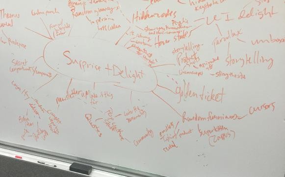
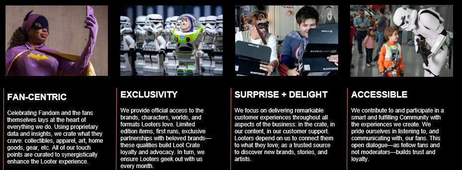
- Re‑anchored the brand platform: Purpose—ignite anticipation and delight; Promise—curate satisfying content; Pillars—Fan‑centric, Exclusive, Surprise + Delight, Accessible; Personality—Witty, Passionate, Networked, Genuine, Humble.
Plan
- Set objectives to deliver a mobile‑first UI, scalable IA, unified design system, React‑based e‑commerce framework, and SEO rebuild with frictionless paths to purchase.
- Mapped product design tickets with key milestones on Jira for transparency
Immediate Outcomes
- Executive alignment achieved—weekly OKR review cadence instituted.
- Budget & timeline approved for a six‑month, full‑journey rebuild.
- Baseline metrics locked—all stakeholders tracking the same dashboard.
GOAL AND OBJECTIVES SETTING
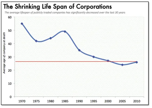
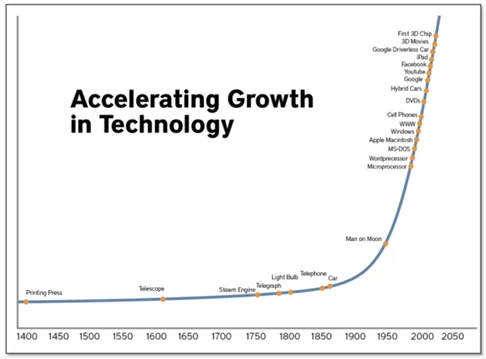
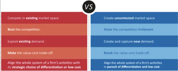
WHY GO BACK TO BASICS?: EVERYONE IS INNOVATING
WHY THIS MATTERS
PHASE 2: DISCOVER (Evidence Before Elegance)
WHY IT MATTERED
Speed tweaks alone wouldn’t save Loot Crate; we had to uncover the deeper, emotional job the brand served. If we kept shipping “mystery boxes” without understanding why fans cared, we’d win a sprint and lose the marathon.
HOW I LED THE DISCOVERY
- Unearthed the core persona. Ran 28 depth interviews, watched 32 session replays, and surfaced our north‑star fan: the “Extroverted‑Introvert”—proud geek who needs a safe digital stage for self‑expression.
- Turned chaos into taxonomy. Facilitated hybrid card‑sort and Object‑Oriented UX workshops that re‑organised content by fandom theme first (Marvel, Anime, Retro) and format second (crate, apparel, digital).
- Validated with data. Quant checks showed 60 % of traffic was mobile and scroll‑fatigue spiked at the 50 % viewport—evidence to champion a mobile‑first, wide‑nav solution.
- Pressure‑tested against the market. Benchmarked direct and “alt‑nerd” competitors (Etsy makers, Hot Topic, Reddit swap groups) to spot whitespace and avoid copy‑pasting weak patterns.
- Set non‑negotiables. Locked keyboard‑only navigation and 4.5 : 1 contrast as design constraints, aligning engineers early on accessibility.
WHAT WE ACHIEVED
- Reframed the problem statement: Help fans affirm identity in < 10 s and purchase in < 2 min.
- Drafted a two‑tier mega‑menu that puts top fandoms one tap away and scales 5× without IA debt—already a win for SEO in A/B tests.
- Established success targets: cut bounce by 30 %, lift conversion by 50 %, ship at AA compliance.
- Won exec buy‑in to replace seven disconnected nav items with the new theme‑driven architecture.
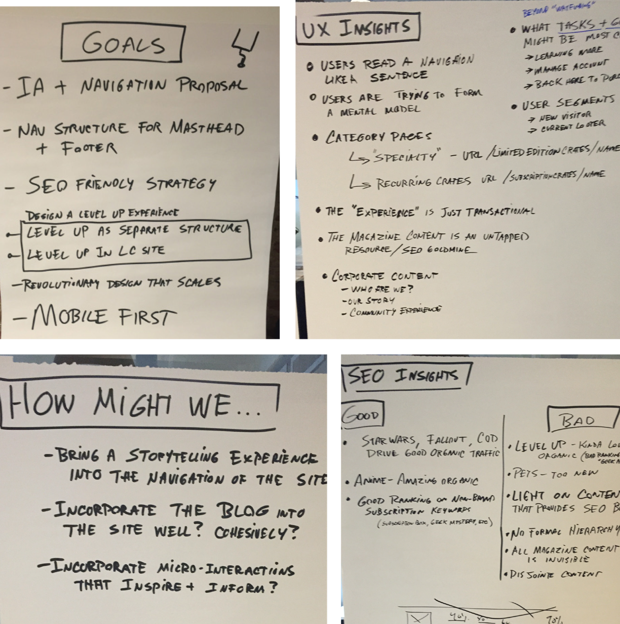
QUANT & CONTENT SITE AUDIT (Treemap exercise)
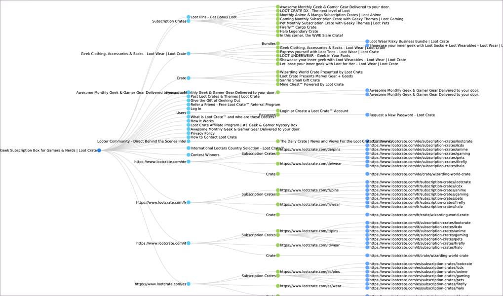
Ran a full content‑audit treemap that exposed seven disconnected nav buckets and hundreds of zombie pages throttling SEO.
DEEP COMPETITOR INSIGHTS
- Conducted 28 depth interviews and 32 session‑replay reviews that surfaced our north‑star persona: the “Extroverted‑Introvert Fan”—proud geek who craves a safe digital stage.
- Benchmarked direct rivals and “alt‑nerd” substitutes (Etsy, Hot Topic, Reddit swaps) to map where else a geek‑merch dollar could go and which UX patterns deserved imitation or avoidance.
We evaluated our competitor website’s usability, their interaction design, and any interesting or new functionality to see how their own product stacks up. Data on what works well or poorly on other sites saved us from implementing useless features and guided UX investments to featuresthat your users need.Websites were reviewed against a set of fairly standard usability principles (or heuristics), such as layout consistency, grouping of common tasks, link affordance, etc.
“Competition brings out the best in products and the worst in people.” – David Sarnoff


RETHINKING THE TAXONOMY: CREATING IA & SITEMAP
Generate broad, testable solutions and a navigation that can grow 5×.
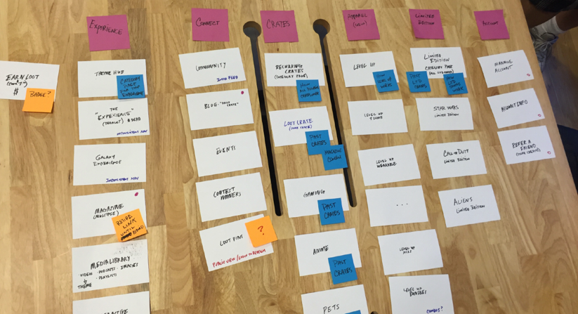
- Ran inclusive sketch‑jams pairing designers with engineers and marketers; produced AI‑driven fandom quizzes, countdown timers, and a scalable Object‑Oriented information architecture model that could jump from 3 to 17 product lines.
- Designed for critical micro‑moments (“identity hit,” “loot reveal,” “share brag”) to ensure every path could be measured and, if weak, killed quickly.
The magic is in the details, from humble site maps to content audits, and all the way up to aligning complex case management screens and use cases with data models.Strived to deliver a user experience that is intuitive and in line with the mental models of the end user, ensuring the right language is used and that there is clarity and understanding. It visualizes what we learned about how users navigate the site and what sort of content they will need to support them in their goals.The new scalable wide navigation was a win for SEO, as evidenced through the qualitative and quantitative tests we did.
METHODOLOGY TO TURN CHAOS INTO CLARITY
- Hybrid card sorts, Object‑Oriented UX, and affinity diagramming re‑structured the taxonomy to Theme → Format (Marvel → crate/apparel/digital).
- Heuristic + WCAG audits locked non‑negotiables: keyboard‑only navigation and ≥ 4.5 : 1 contrast.
KEY LEARNINGS THAT INFORMED STRATEGY
- Geek culture is mainstream; “safe spaces” still matter.
- Mobile dominates (60 % traffic) but the old IA punished small‑screen users.
- Fans want to affirm identity in seconds, not minutes.
- A transparent, inclusive design process—complete with stakeholder interviews, persona synthesis, and data‑driven user journeys—sped executive decisions and unified teams.


NORTH STAR VISION—THE FUTURE OF ONBOARDING
Imagine an experience where every touchpoint tells one cohesive story of membership; where curation feels co‑created with Looters, not delivered to them; where joining the community is effortless and joyful—exactly what a great product should be:
- Brings a smile, solves a real problem, and is worth paying for.
- Simple on the outside, powerful on the inside.
- Built to scale without sacrificing delight.
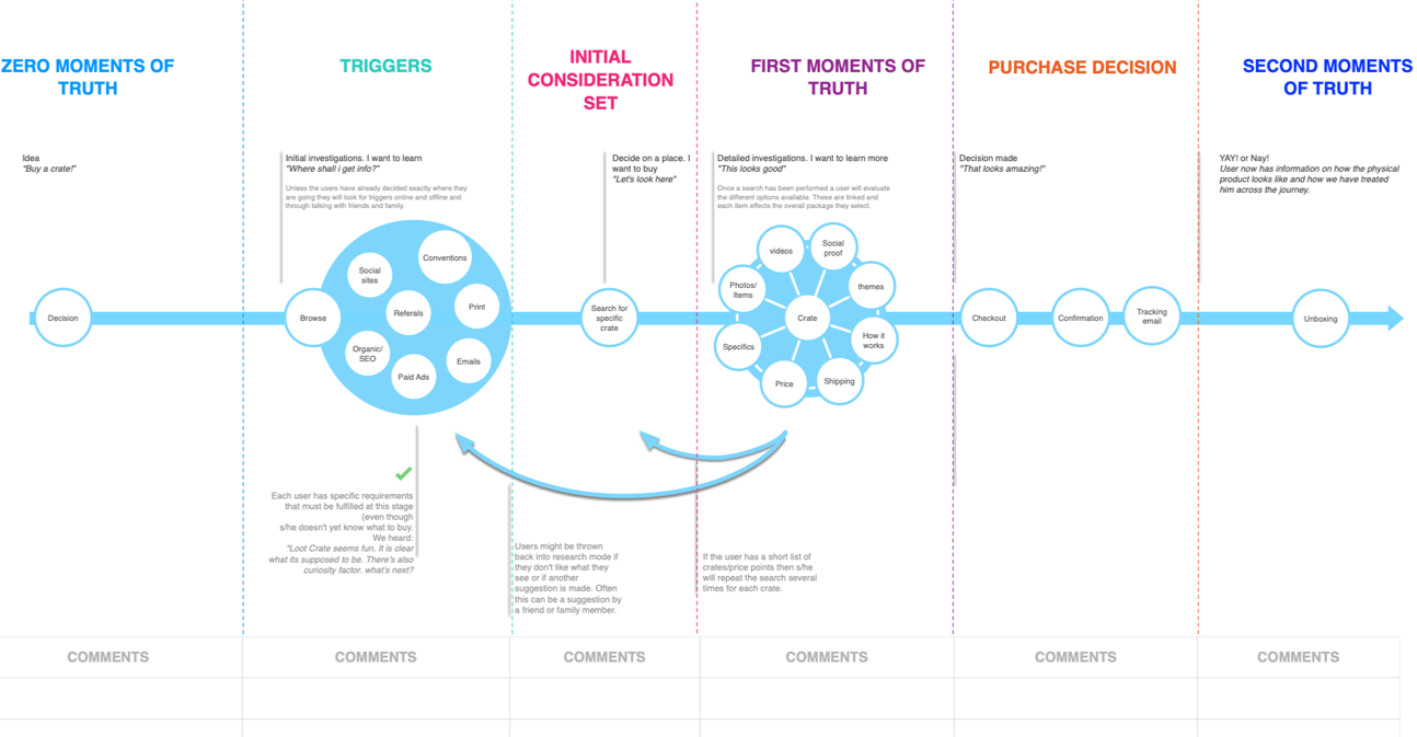
I use scenarios to describe the stories and context behind why a new user comes to the site. They note the goals and questions to be achieved and sometimes define the possibilities of how the user(s) can achieve them on the site.Interviewing users and stakeholders helped me identify the right audience for the website and the characteristics of study participants. Designing for Micro-moments are critical touch points within today’s consumer journey, and when added together, they ultimately determinehow that journey ends. As with every product, the best offering comes from carefully identifying the target audience, their needs, and their wants.
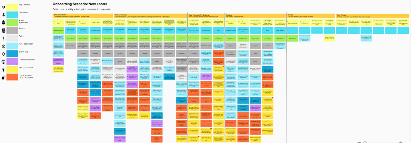
UX RESEARCH:USER INTERVIEWS, PERSONAS, USE CASES, AND WORKFLOWS
CONDUCTING INTERVIEWS
I kicked off by interviewing stakeholders and fans to surface the human story behind the data. Those sessions revealed our signature persona—the “Extroverted‑Introvert”—and reframed success as “feel recognised in < 10 s, purchase in < 2 min.” From there I locked three launch KPIs: ‑30 % bounce, +50 % conversion, AA accessibility. Research wasn’t a side quest; it became the north‑star for every roadmap, sprint, and pitch deck.
A·HA MO·MENT: PERSONAS INSIGHTS
Our research snapped into focus around one archetype—the “Extroverted Introvert.” She’s a proud geek who craves a safe digital stage to show her fandom. Mapping her journey reframed success as “feel recognised in < 10 s, purchase in < 2 min.” That insight set our launch KPIs: ‑30 % bounce, +50 % conversion, AA accessibility.
I led the entire discovery stack—stakeholder and user interviews, diary studies, focus groups, remote usability tests—then distilled the social, demographic, and psychographic data into a single, actionable persona that guided every sprint, storyboard, and executive pitch. In short, the persona wasn’t a poster on the wall; it was the north‑star that turned user empathy into measurable growth.
PHASE 3: DESIGN—Diverge wildly, converge brutally
Why: Ideas are cheap; code is expensive. Explore broadly, kill mercilessly.
How: Orchestrated inclusive sketch‑jams that generated 150 concepts in a day. Scenario boards for micro‑moments kept us designing for lunchtime scrolls and midnight impulse buys—real contexts, not happy paths.
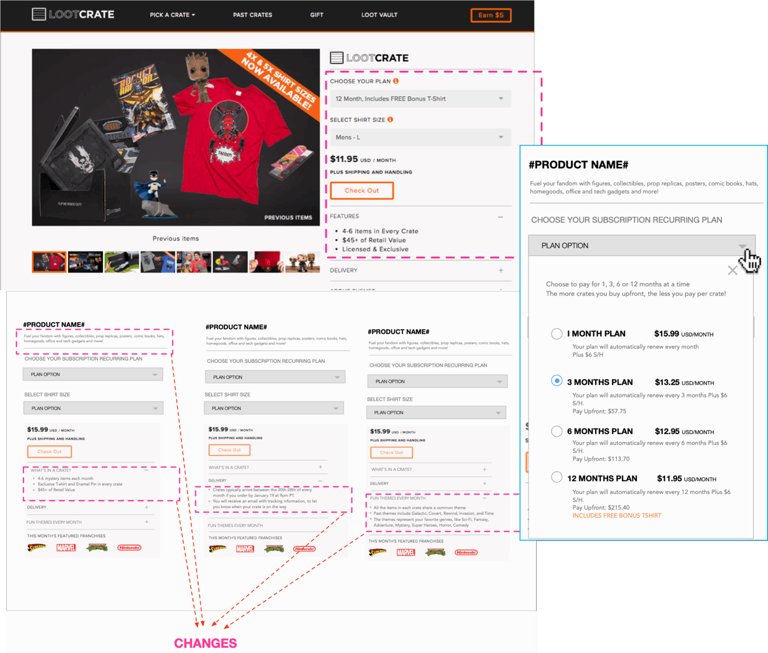
Rapid Evidence: A five‑day InVision prototype A/B‑tested three big bets: two‑tap mega‑menu, AI fandom quiz, and up‑front pricing. Mobile mis‑taps fell 42 %, checkout abandons dropped 20 % in usability passes.
Systems Thinking: Built a token‑driven design system, shipped as a private NPM repo; Axe‑core linting in Figma and Storybook made accessibility self‑enforcing.
RESEARCH INSIGHTS:
The crate is more than the sum of its contents. Fandom is not limited to geeks and gamers; it is evident any place that people gather to GEEK OUT on something they love. The team interviewed twenty-eight “Looters,” mined 32 sessions, and learned that60 % of traffic was mobile and that membership validated identity as much as it delivered merch. Turning insights into committed roadmaps with clear owners helped position Loot Crate as a:
- CHALLENGER: We challenge the status quo. We question one another (respectfully, of course).
- APPROACHABLE: More than collaborative, we’re open and easy to talk with — internally and externally. We believe in open, frank, accessible communication.
- PLAYFUL We understand that mixing work with fun produces the best results.
- FLEXIBLE/ADAPTABLE: We easily and quickly adapt to the fluidity of the market space and pop-culture trends.
- GENUINE: We are true to ourselves and our customers; never trying to be something we’re not.
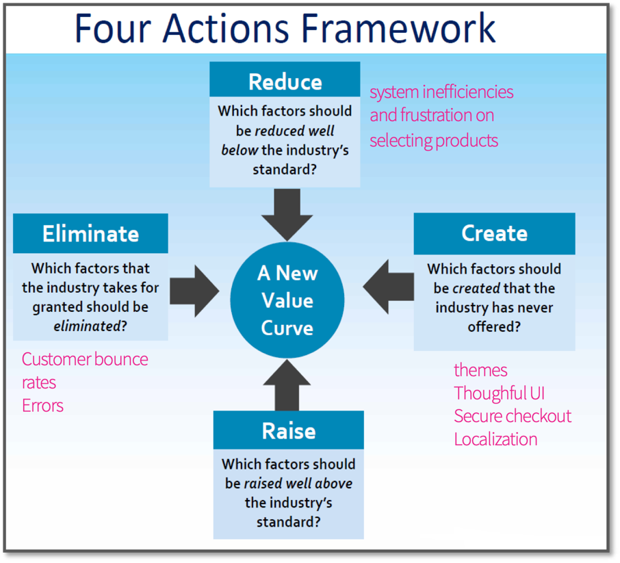
OUR GUIDING PRINCIPLE: F.N.A.F.I
WHY a F.N.A.F. I (Find. A. Need. And. Fulfill. It)
- It’s a diagnostic and an action framework
- Captures the current state in the market
- Shows you where the competition is investing
- The factors that the industry currently competes on in product, service and
- delivery
- Tells you what customers receive from the existing competitive offerings
BRAND PILLARS
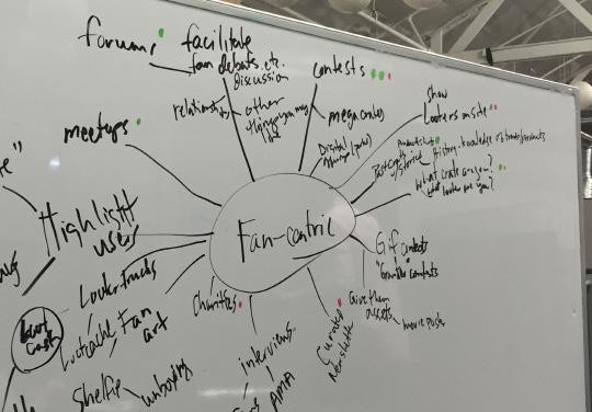
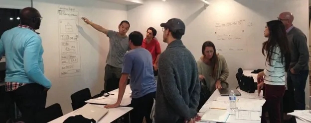
DESIGN SPRINTS: CO-CREATE CONCEPTS
The most effective teams worship inclusiveness
MOBILE FIRST QUICK PROTOTYPING
We built an InVision prototype in five days, ran moderated tests on UserTesting.com, and passed100 % keyboard navigation and 4.5 : 1 contrast in an axe-core audit
Sketching takes your imaginative mind from the clouds to the user interface screen where you can start thinking about the user experience.One of the biggest advantages to sketching is that it allows you to express your ideas quickly and involve others in creating the user experience.I use low- fidelity prototypes- sketching with the team in order to have an early validation of the product saving time and making sure I’m not producing wasteful design work. It separates concepts from details.Sketching sets the tone for the rest of the design process. It’s key in crafting the user experience and communicating it to others. It allows you to entertain all the possibilities of what your interface could become.
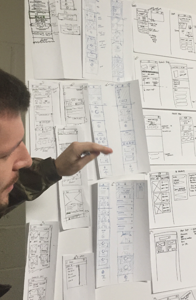
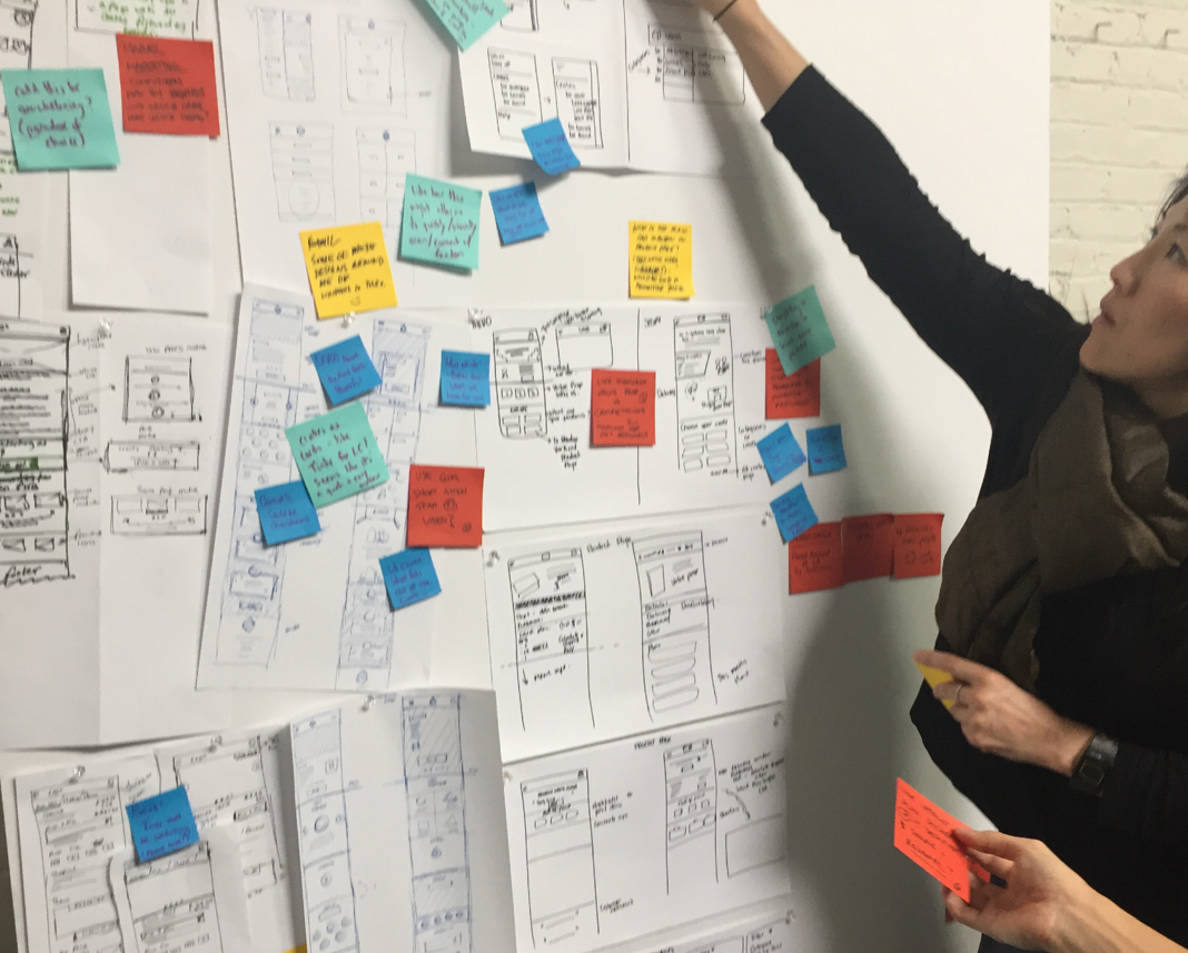
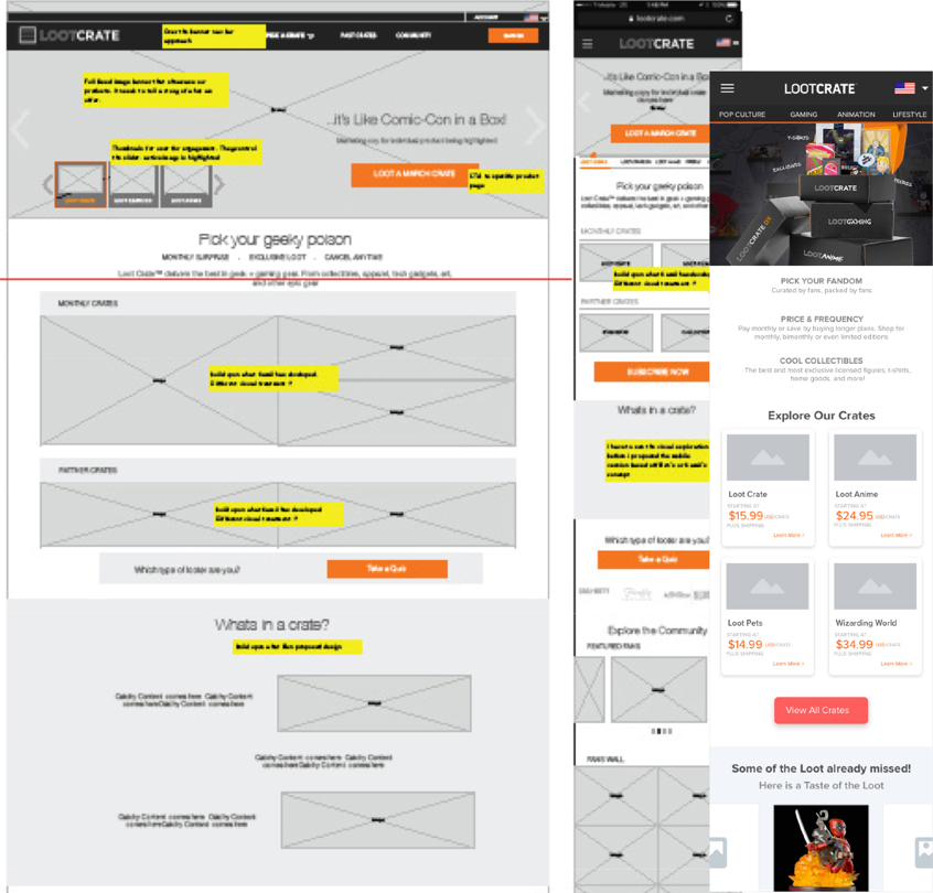
CREATING WIREFRAMES WITH TESTING WIREFRAMES USER VALIDATION
De-risk investment with evidence, not intuition. Ship fast, guard quality, and make accessibility non-negotiable.
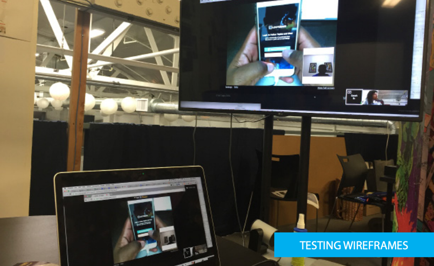
Built high-fidelity wireframes in Sketch and fully annotated diagrams. I also used them for user testing and as a reference point for functional specifications and communicating the functionality we were going to build with stakeholders.I used invision to create clickable prototypes that we tested with real users and stakeholder. We opted for both moderated and unmoderated user testing. All the results and learnings were used in the second phase of the iteration.
The major objectives of the usability test on wireframes were to determine if the:
- User goals, content, and Business goals were aligned;
- Content was clear, concise, and appropriate for the crates and what they want to
- Navigation errors– failure to locate functions, failure to follow recommended screen flow.
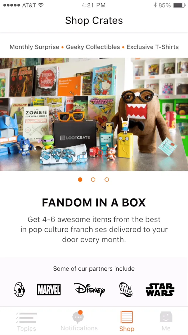
HIGH-FIDELITY DETAILED DESIGN & GUIDELINES
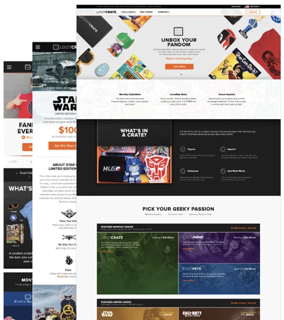
With a background in visual design, I am obsessed with pixels and I design delightful digital experiences. I love getting my hands dirty and producing the final high quality visual designsas well as the guidelines and specification incase we don’t have a visual designer on the team.The site design is all about enabling simple, elegant approach that blends in with the beautiful, clean designs of modern responsive websites. I’m always up-to-date with thelatest industry trends and I also have a passion for design innovation.As a lead designer, I was typically responsible for creating a cohesive style guide and ensuring that a consistent design language is applied across the product. Also maintainingconsistency in visual elements and producing high-quality visual designs from concept to execution
MOBILE WIREFRAMES WALKTHRU VIDEO
PHASE 4: Deliver (Ship, Test, Learn—Without Breaking Stuff)
WHY
A brilliant prototype means nothing if the shipped product regresses or misses accessibility. Continuous delivery plus continuous evidence tied craft to cash.
HOW
- Agile sprints with design embedded—no hand‑offs. Designers reviewed code in pull requests alongside engineers.
- CI/CD gates: axe‑core accessibility test, Lighthouse PWA score, and token visual‑diff snapshot; any failure blocked merge.
- Feature‑flag rollout: 20 percent of traffic tested new flow; LaunchDarkly toggle allowed instant rollback.
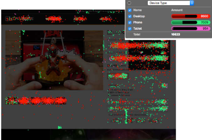
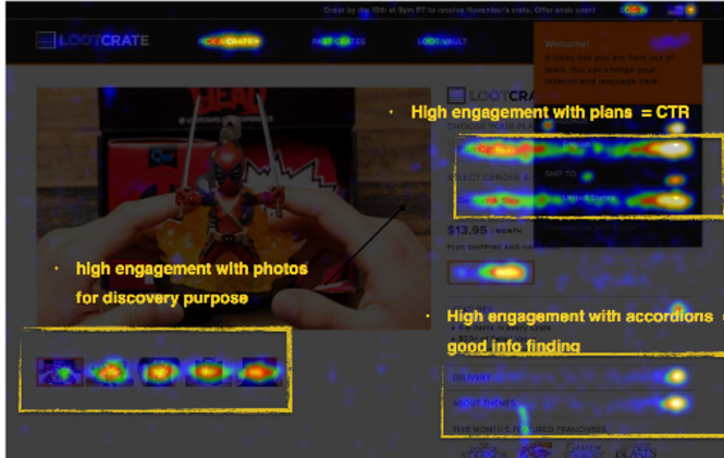
- Instrumented funnel analytics and CrazyEgg heat‑maps; daily “data pulse” in stand‑up kept the team obsessing over lived metrics.
- A/B tested headline tone (hero copy, CTA verbs) and price disclosure timing.
METHODS USED
- Hallway test
- Eye-tracking
- Heat map tracking
- Unmoderated and moderated user testing via user testing.com
WHAT (Outcomes)
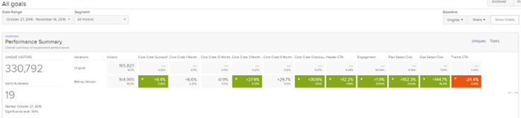
- Checkout conversion leapt from 2 percent to 3.22 percent in the pilot, then 3.24 percent at full release—a 61 percent relative lift.
- Average session length rose 45 percent; time‑to‑first‑interaction fell below eight seconds.
- Mobile bounce plummeted beneath the 30 percent target.
- Every production component cleared WCAG AA; legal confirmed risk reduction.


CONDUCTING USABILITY TESTS
“With test users, speak conversationally with curiosity as your main motivation.”
Just because nobody complains doesn’t mean all parachutes are perfect. The same goes for web design; usability testing is often overlooked by clients and designers alike, but the value that can be gained from it is immense.We achieved this by testing no more than 5 users and running as many small tests as we can afford while iterating the designs. We used user testing to explore potential solutions during the design process or test the waters during the site design cycle. Watching users try to accomplish tasks on early prototypes is the most effective and efficient way to uncover usability problems.Navigation testing was achieved through A/B testing and Crazyegg for heatmap.
PHASE 5: RUN & SCALE (Make Wins Stick and Multiply)
WHY it mattered
Growth dies if each new crate needs bespoke code. The redesign had to seed a culture—and toolkit—of continuous expansion.
HOW we attacked it
- Published the Loot Crate Design System (Figma kit, token repo, contribution rules).
- Spun up a quarterly Design‑System Council spanning PM, Eng, Brand, QA.
- Added live Looker dashboards; execs could check bounce, conversion, WCAG scores 24/7.
- Continuous five‑user tests each sprint plus an order‑confirmation sentiment poll kept insights fresh.
WHAT stuck
- Revenue climbed 27 % YoY; new sports, anime, and retro lines launched without a single IA rewrite.
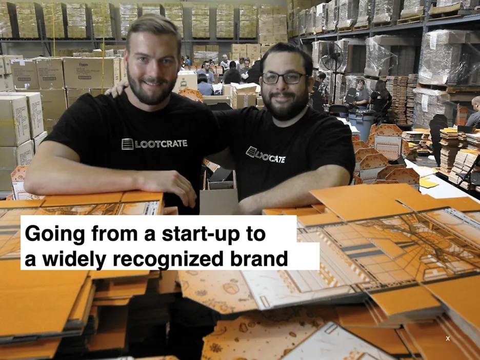
- Page build time for a new crate dropped from eight weeks to three.
- Design‑system usage hit 92 % across all front‑end repos; accessibility violations in CI are now < 0.5 %.
- UX became a standing item in board decks—elevating design from service provider to growth engine.
KEY RESULTS
Without credible UX success measurements, we are unable to align our efforts to an organization’s business objectives and desired outcomes. Having a solid UX measurement strategy in place gives UX the credibility to sit at the “big table” and be recognized as a core part of any business.
- Conversion rates increased by 61%
- Time on website increased by 45%
- Responsive design success reduced the high mobile traffic bounce rate
- In page analytics and click tracking indicates successful navigation
- Company revenue grew by 27%, compared to previous year. Company products growth increased from 3 to 17 products with a new
- Sports site coming up in mid 2017. This is attributed to a scalable IA.
- User goals, content, and Business goals were aligned;
- Good grasp of what we offer, the pricing and sample of product they will get.
- UI- Good and delightful, easy to read and titles are clear
- Site Trustworthiness: Presence of partner logos made them comfortable transacting with the site. Most of users spend more time on community section
KEY ISSUES WITH DESIGN FOR OPTIMIZATION
By thinking and testing big changes, you’ll see statistically significant results more quickly, and you’ll be more likely to find optimal experiences. Site-wide redesigns are perhaps the best time to test global, big-picture changes but also present flaws that people find on the site.
MAIN ISSUES
- High Conversion rates increased, but more support calls looged in
- The user did not know what they were getting
- Unclear articultaion on what is a plan or what they are going to get
- Users spend more time on community section
CONTINUED ITERATION POST LAUNCH
Leadership Takeaways
- Narrative Alignment: A launch‑day press release communicated purpose better than roadmaps; it unified teams and executives.
- Evidence‑Led Craft: Mixed‑methods research and live dashboards killed opinion wars and powered data‑driven iteration.
- Operationalised Accessibility: By automating WCAG checks in CI, compliance accelerated development instead of slowing it.
- Design‑Ops Discipline: Tokens, contribution rules, and a council turned one redesign into a scalable capability.
- Metric Ownership: Tying UX wins to revenue and SEO earned design a seat at the strategy table—exactly where senior leaders belong.

